Messenger App Design (uTu)
My Role: I was the primary product designer on this project, responsible for visual, wireframes, and interaction design.
Problem: We wanted to make a messenger app that had multiple channels of communication (SMS, Email, Instant Messenger, and Video Messages) without being overwhelming to the user.
I compiled questions for research through data research and a competitive audit.
Research:
Competitive Analysis:
I wanted to learn what the competitors were doing correctly. All of the apps had their ups and downs, but they each offered something unique that kept their users coming back.
Take aways from audit:
All of these applications used data-based messaging.
The apps synced with your contacts to find out other people you know using that app.
They all focused on one type of messaging.
All of the apps were on iOS and Android.
User Research:
Focus Group: In the focus group we were able to find out a lot of information in regards to users and their messenger apps. We put together a group of people ranging from ages 18-55. We also made sure to get users with different levels of technology experience. By doing this we were able to get a well-rounded perspective on what a user wants out of an app. During the focus group, we asked questions on the user's daily habits of messaging. These were the takeaways from the group exercise:
All the users were familiar with email.
The younger users tended to send more messages and data messages.
Most of the older users only used emails and text messages.
Most of the users valued a strong search feature.
The younger users used two or more messenger applications.
All the users were worried about battery usage.
All the users enjoyed simplicity when using applications.
Friction:
During research, we found out that a 3rd party application cannot control iOS's SMS messaging. This information put a halt to our design process and forced us to make critical decisions in the early stages of the design process. We would either have to make a standalone iOS version of the app without the SMS features or continue as planned with an Android-only app.
We decided to focus heavily on an Android-only app. The decisions brought us back to the drawing board with our designs, but this worked out in our favor because Google Material Design was released later that month. After analyzing the Google Material Design standards, I started the exploration of the new design.
Personas: With the data collected we were able to make three major personas.
Techie:
The user has had technology most of their life
The user has multiple messenger apps
User ranges from age 18-35
User is not afraid to try new technology
Sends 200+ messages a week on multiple messengers
Intermediate:
The user is familiar with technology, but does not take it too seriously
The user only uses two messenger applications
User ranges from age 25-55
Apprehensive to try new technology
Sends less than 200 messages on multiple messengers
Novice:
The user is not familiar with technology at all
User maybe uses one messenger application
User ranges from age 40-55
The user does not like trying new technology
Sends less than 10 text messages a week
Exploration:
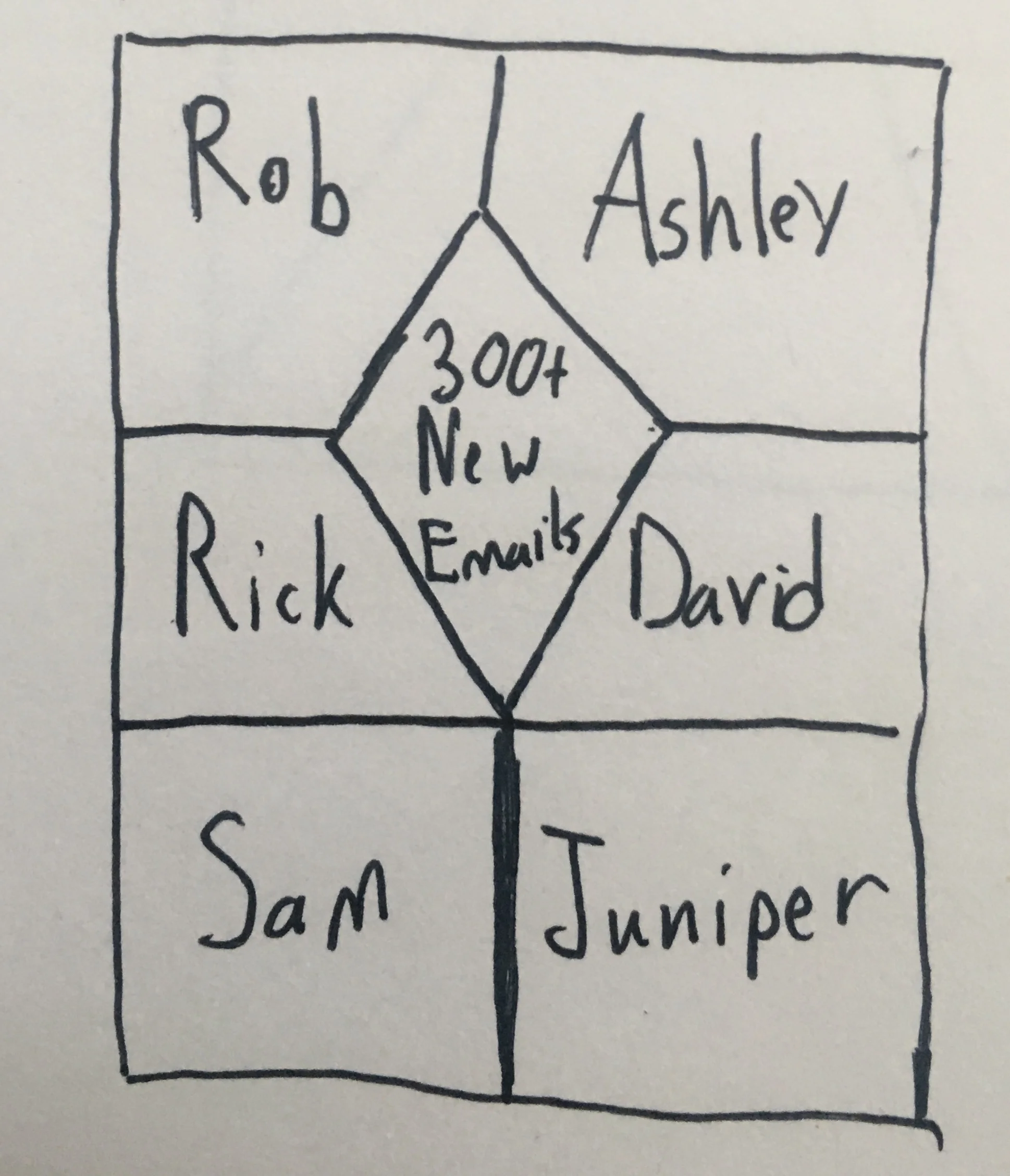
I began the brainstorming process by drawing paper wireframes. I had a couple of questions I asked myself from the research during this portion of the process.
Is this design simple enough for everyone to understand?
What should the thread layout look like?
Which messaging channel is the most important?
How should these messaging channels be identified?
Does this adhere to the Google Material Design standard?
These designs include some of the sketches I made before finding out we couldn’t make an iOS app. I tried many different shapes and layouts to see what showed the information in the best way. After going through some trial and error, I realized we weren't trying to reinvent the wheel. I decided to go with a regular message thread but added visual markers that differentiated the channels. By doing this, the app looked familiar, but there were new ways to identify messaging channels.
The layout I chose was familiar to the user because it is the standard industry messaging thread.
The research showed that email was the most important messaging channel.
We decided to use color and sizing to differentiate the channels.
We followed the Material design standards of that time.
Prototyping and Flows
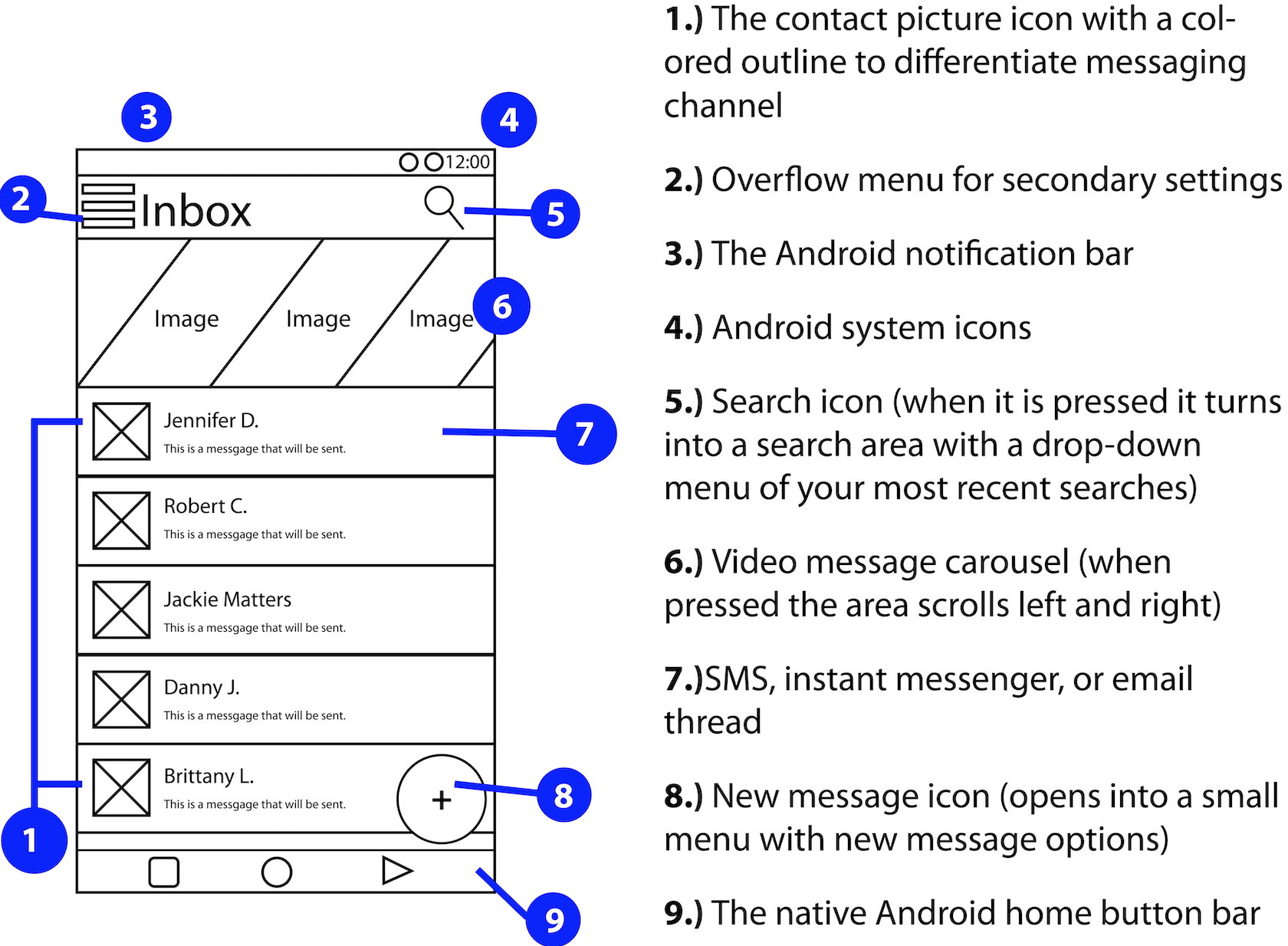
Since the user will be spending most of their time sorting through messages, I created a wireframe of the messaging thread.
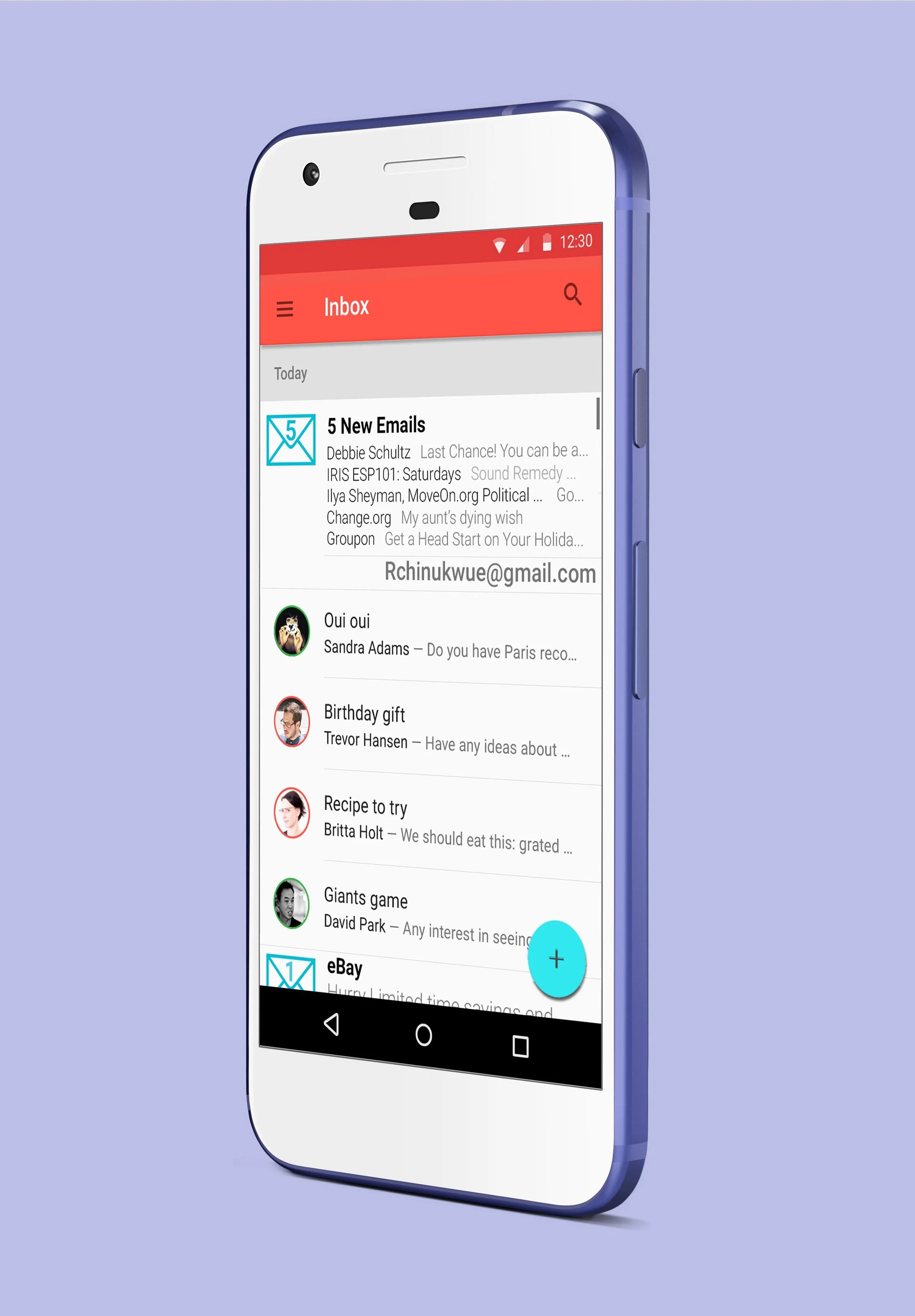
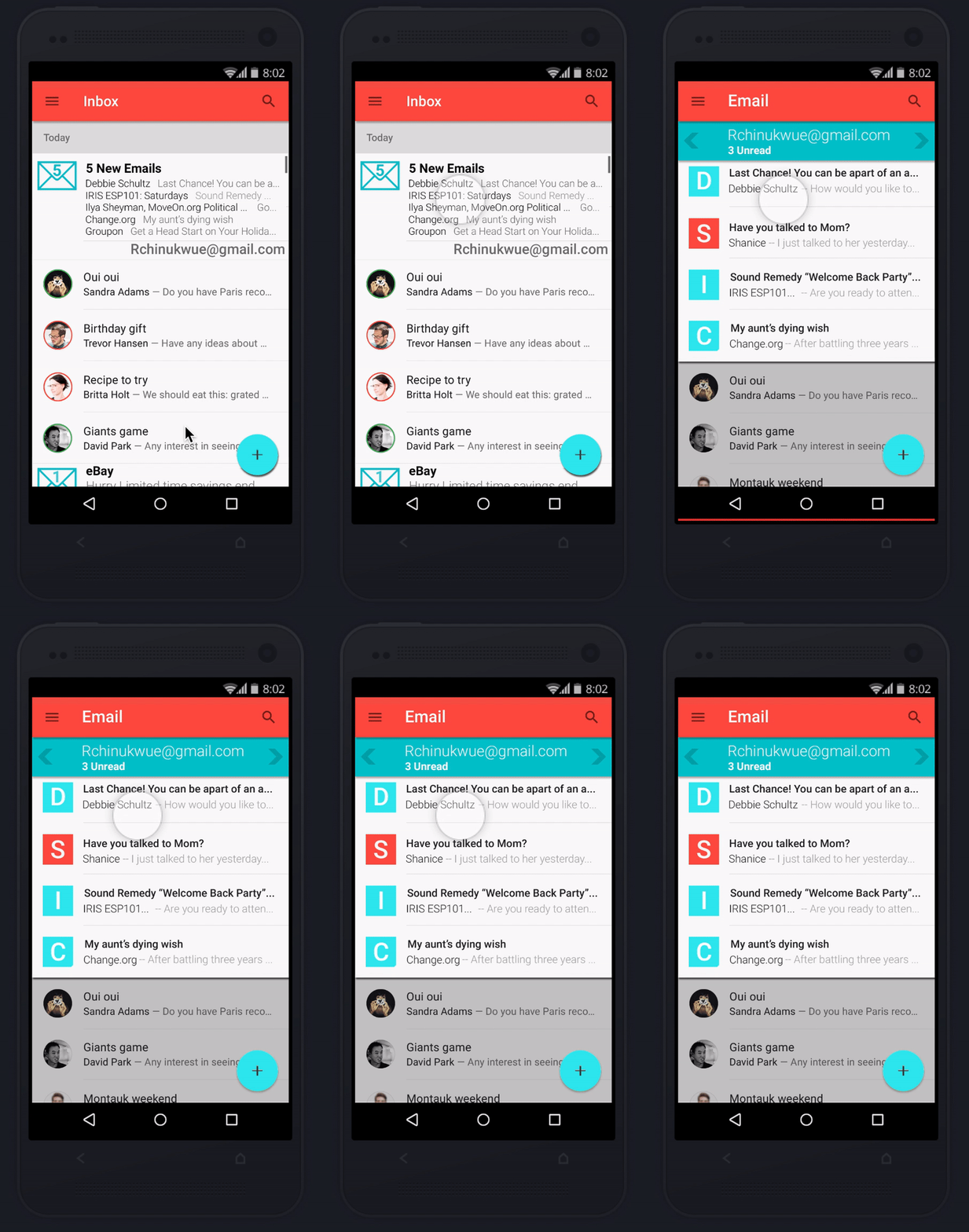
The wireframes show the main message thread where all the channels are in one compressed thread.
I created wireframes to show the flow of how the users accomplish these common tasks:
Navigating a simple message thread that is familiar and easy to differentiate the messaging channels
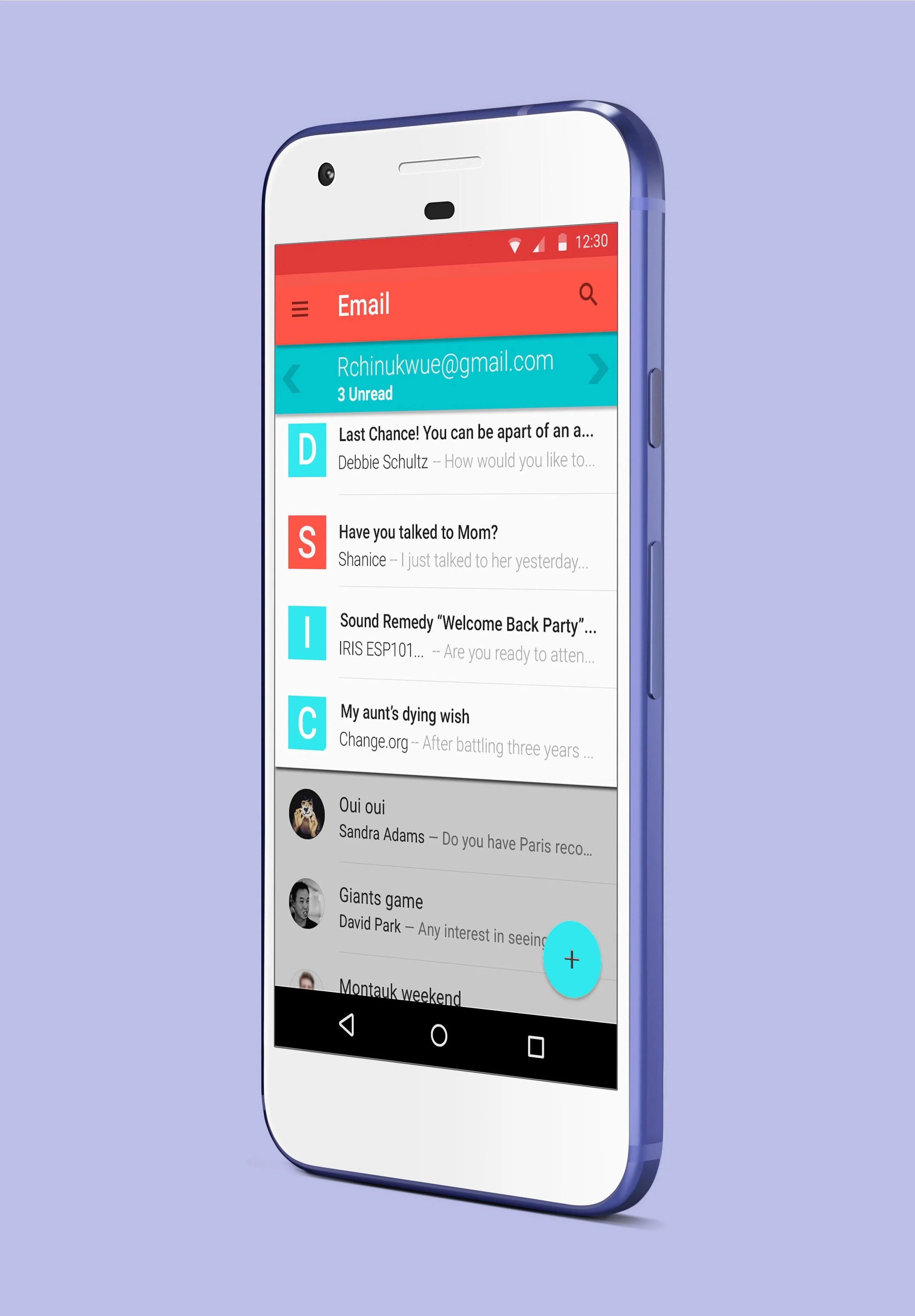
Easily check their email within other messaging channels
The user opening and closing the email thread overlaying the messaging thread
I used Adobe Illustrator to make the wireframes of these screens. The main area of focus is the email thread. Majority of the users in the focus group highly valued email. I highlighted the emails by making the inbox large than the other message channels.
The email area can then be pressed and will overlay over the main message thread (SMS, instant messenger, and video messages). That area then becomes a separate scrolling area separate from the main thread.
The next part to simplifying the design is the colored ring around the contact picture. The different colors signify different channels of messaging (SMS and instant messenger). This method allows these two channels to live in the same thread, but you can easily tell the difference. Exposing the user to a similar scenario, but with visual cues that guide them to the correct channel.
Outcome:
I enjoyed working on this project. It was very interesting to see other people's outlook on technology. I was able to make a design that touched on ease of use, familiar layout, and a simple interface. My main focus was to avoid congestion with all the channels in one screen. I knew there would be a lower adoption rate in the intermediate and novice personas if the screens were congested. The overflow menu served as a place to put secondary information that the user did not need to see. Adding the search bar at the top of the screen also made it easy for the user to look through their inboxes seamlessly.
Implementing Material Design brought the app to life. Google made it very easy to choose the color pallets because of their suggested color combinations. Also, adding shadows under icons and menus gives the app depth and guides the user to take action within the app.

