Leverege.com Design Challenge
Challenge Briefing: The goal of the platform is for a nurse manager at a hospital to easily locate different devices on wheels (Ventilators, Pediatric Beds, etc).
Information Provided: Hospitals frequently misplace expensive pieces of equipment on wheels. For the solution, we've attached a GPS tracker to these pieces of equipment and created a dashboard where a hospital employee can log in and see the last known location. The sensors are powered by the machines themselves (not by a battery), so if the machine is unplugged, the last location is where the machine was plugged into the wall. Our team created the current desktop solution in 2 weeks. It runs on simulated data.
Challenge: Build (in sketch or illustrator) a mobile version of this solution.
User Research:
I conducted a questionnaire focused on asset tracking apps and general workplace processes.
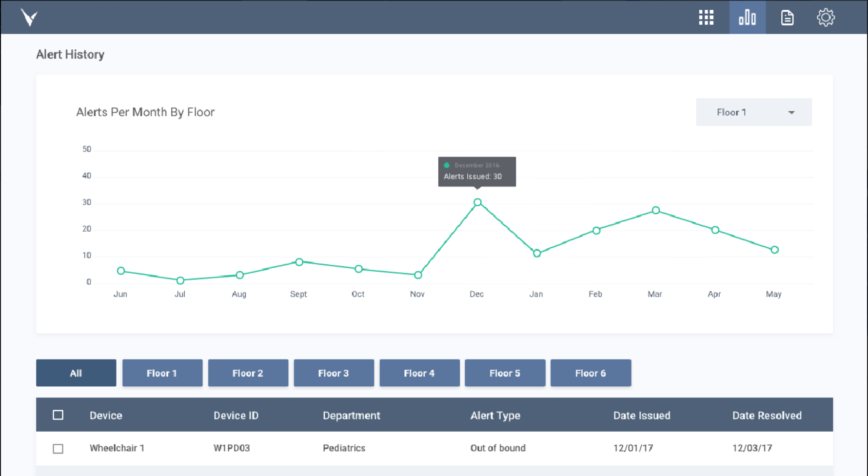
I analyzed the desktop application hands-on.
Competitive Analysis:
The data below shows the similarities between the competing asset tracking companies.
*An example from a competitors software
The software had an outdated look and feel.
They were all visually simple applications.
They used different colors to highlight certain parts of the application.
Some of the maps were hard to read because of the color choice.
Data Found From Interviews:
Users usually have one iPad per department.
The average screen size I would be designing for would be 2048x1536 px for Retina iPad 3, iPad 4.
Many of the users' hospitals did not have asset tracking programs.
If they had these systems, it would mostly be used by the Nurse Manager.
Users enjoyed the application and liked the visual markers of the devices.
The age range of the employees ranged from 18-65.
Most of the employees are in their 30s and older.
The competitors' apps were very dated and lacked modern functionality or design.
The user really enjoyed the map and the list of missing assets.
Personas: I created these personas through questionnaires.
Upper Management:
They will be using the app for annual data for the hospital.
The app is used to to increase ROI.
User uses the application to set goals for the Nurse Manager to implement.
Nurse Manager:
The nurse manager is the main user using the app.
User uses the metrics to set department goals and monitor compliance
Nurse:
Nurses will be using the application the least.
The user will need the application mostly during an emergencies.
Exploration:
Desktop Application Analysis:
I first looked at the desktop application to analyze what was most important on the screen. Through the data collected from the questionnaires, I was able to identify what the user needs and doesn't need.
Secondary Items
Top menu
Left side floor menu
The floor dropdown in the on the “Alert History”
The list of assets that are in the correct location
Important Items
The search bar
The map
The missing assets
The floor that you are currently on
Icons indicating what page you are on
Wireframing and Ideation
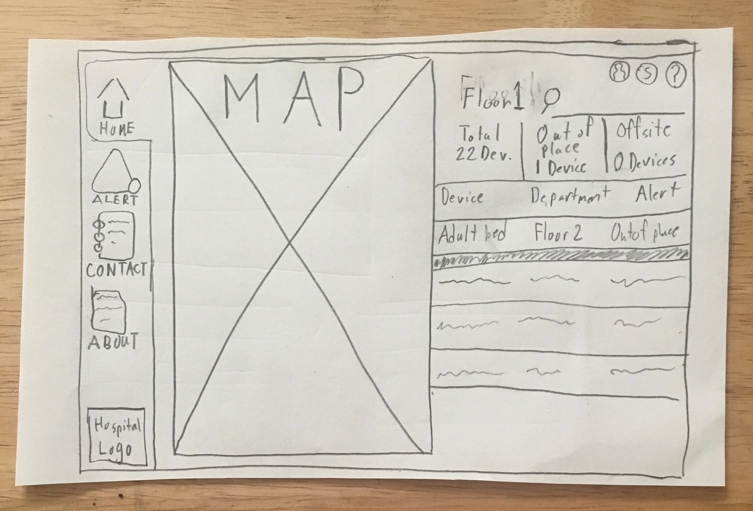
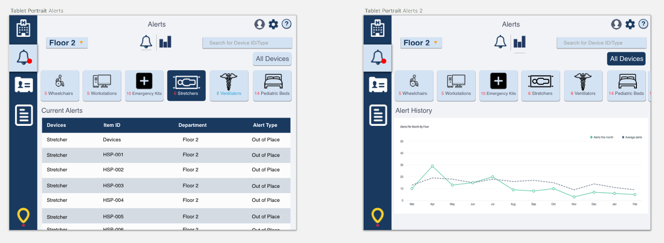
I then started brainstorming with sketches of the app in the iPad form factor (2048x1536 px) . I used drop-down menus and filters to pack a lot of the information into a smaller screen. I did not want to lose the essence of the desktop app by stripping it down too much. By consolidating the secondary items, the features that are needed are at the forefront.
I wanted to make the mobile experience similar to the desktop app. The floor menus were also taking up a lot of the space on the desktop app. Through research, I found that most nurse managers only have access to their floor. Having this knowledge guided me to make that a drop-down, and take up less space. I used the same colors to keep the app familiar. A good majority of the users are older people and sometimes may have trouble with software that deviates from the original design on the desktop app.
I focused on certain visuals and interactions that help guide the user in using the app:
Here are some below:
The search bar is on every page.
By having a search bar on most pages, the user can search the database easily for devices.
I put the (lost) device alerts at the top of the list view (in red) and then the other device in alpha numeric order. -
The devices are organized from most important to least important. In a hospital environment, the lost devices are the most important. A lost device can mean life or death for a patient.
I changed the lost asset icon and font to red.
I wanted to show the lost items in a warning color. Real-world objects like stop signs, traffic lights, and phone notifications use red as a call to action color.
The floors are now in a drop-down menu with a red dot on the right side to indicate missing assets.
(I made these items a drop-down menu to save space on the mobile version.)
I added a smaller tab menu on the left side to get to the other pages.
I made icons as a space saver decision for a mobile device.
There is now a logo at the bottom left of the app as branding for the hospital.
The logo customizes the software for the organization.
In the "Alert History" page I added the option to see the data in list view or graph view.
I changed the font color of certain items to make the app seem less flat.
I made the asset font a bright blue to indicate that they are clickable.
I added a login screen for HIPAA compliance.
In hospitals, security and patient confidentiality are very important.
I made asset tabs in The "Alert History" page for easy filtering.
The user has multiple search options (map, search bar, and the list of assets), so they can navigate the app however they feel comfortable.
Outcome:
This project thought me that the hospital asset tracking market is very open for interpretation. It is vital to know where the lost items are in a hospital because emergencies can happen at any moment. Hospital personnel needs to know where the assets are at all time. The alerts tab helps to show the history of where the asset has been. This feature helps to ensure the asset stays in the right location. The filter buttons are a visual marker for the user to find the assets. My solution makes it easy for all users to find the asset at a glance, and a similar app design makes it easy to go from desktop to mobile.


