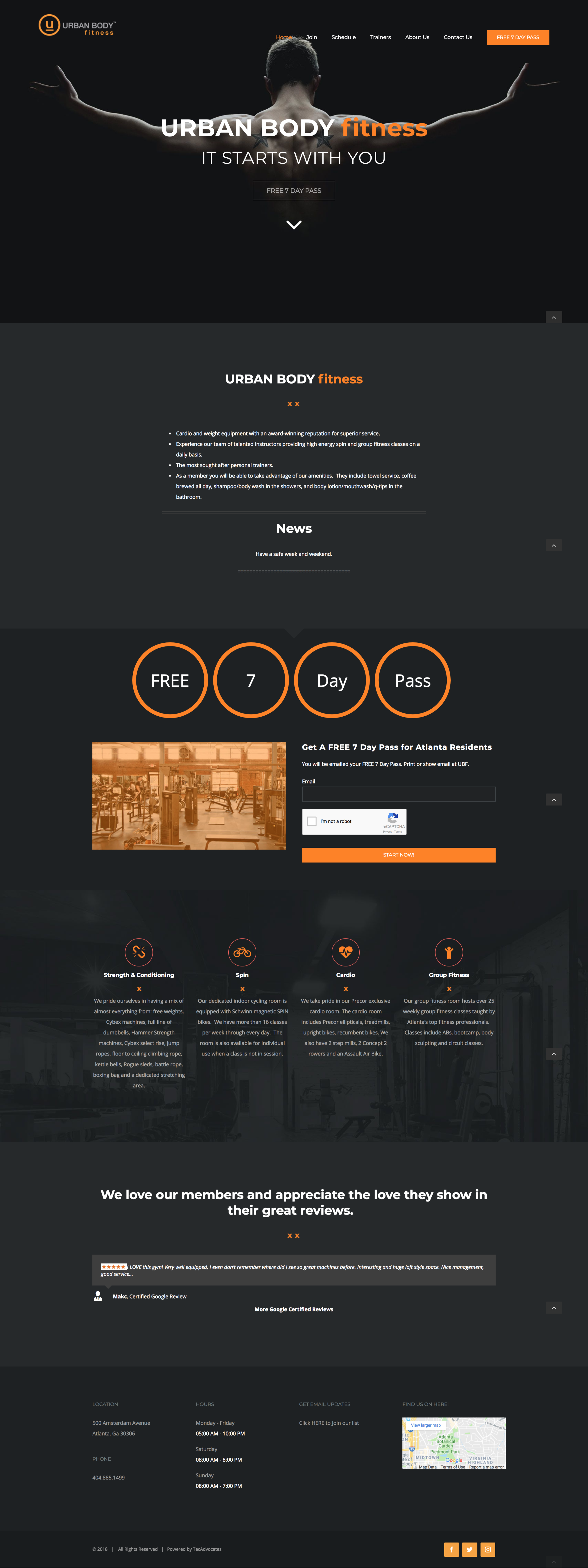
Gym Membership Website
My Role: I was the UX Designer for this project. I collected the data to guide our workflow of the website.
User Needs:
The user is looking for a new gym membership.
The user needs an easy to navigate website.
The website needs to cater to current members and prospective members.
Assumptions:
The user wants to workout.
The user is looking for a deal.
The user wants a trial period for the gym.
User Goal: Client wants prospective users to be able to navigate to 7-Day Pass Easily
User Research:
Survey Questionnaire: We gave surveys to the current members through MailChimp.
Google Analytics: We also collected data on the pages user spent the most time on. The users mostly found the website through their social media outlets. They then used a link to get to the homepage. The data showed that we needed to focus on getting the customer on the landing page.
Personas: With the data collected from the questionnaire I made these personas.
Prospective Member:
The user who is in need of a gym membership
The user is actively shopping around for the best-priced gym membership.
The user is interested in the gym membership trial period
Current Member:
The user currently has a gym membership.
The user uses the website to find out information regarding classes, trainers, and general gym information.
Exploration:
Wireframing and Ideation:
We ended going with a sleek dark color scheme because of the owner. He felt like that would be appealing to people. We then highlighted important information areas with an orange highlight. These highlights mainly guide the new users to the free 7-Day pass. The rest of the landing page gave general information and catered to the current members.
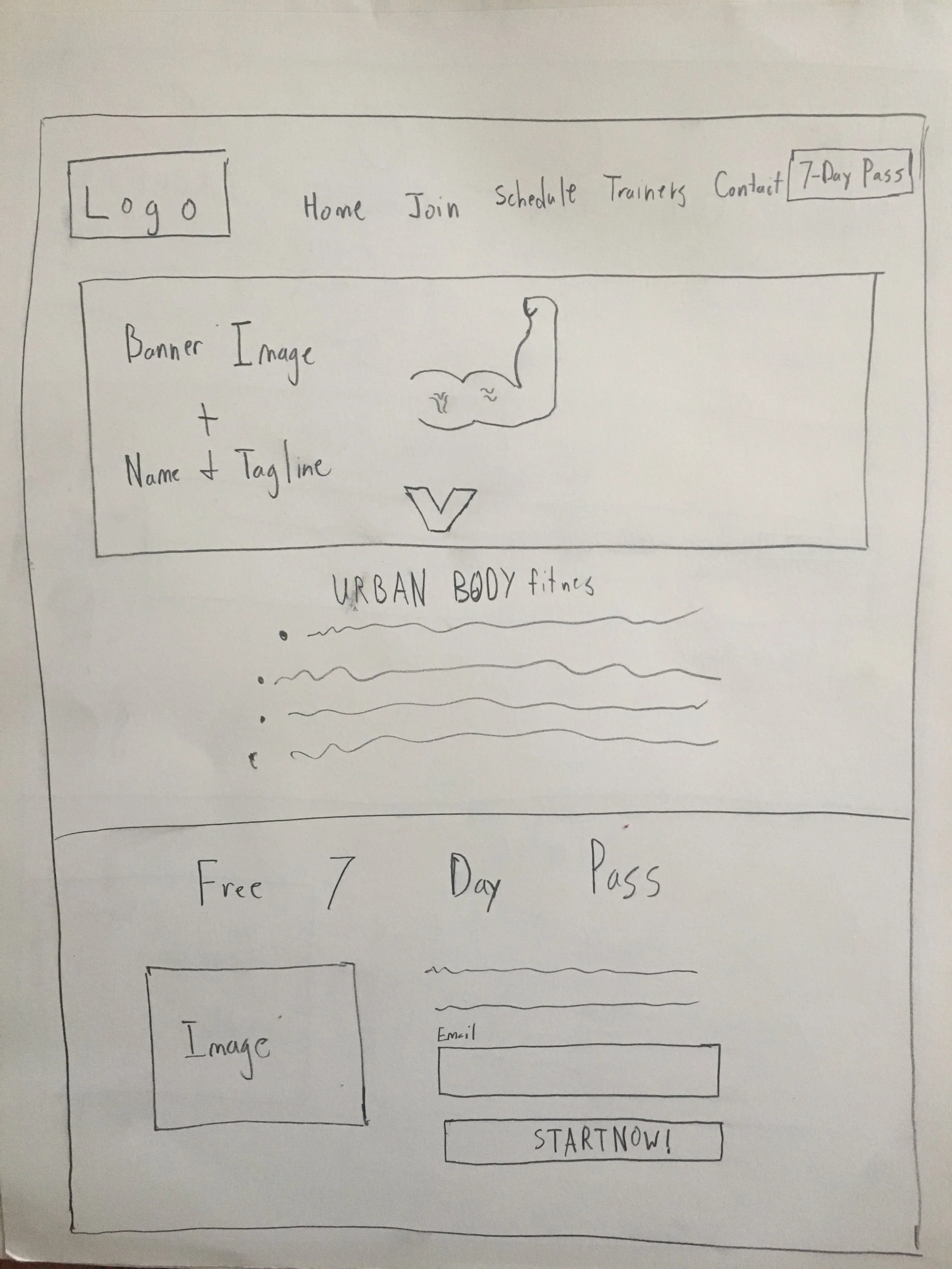
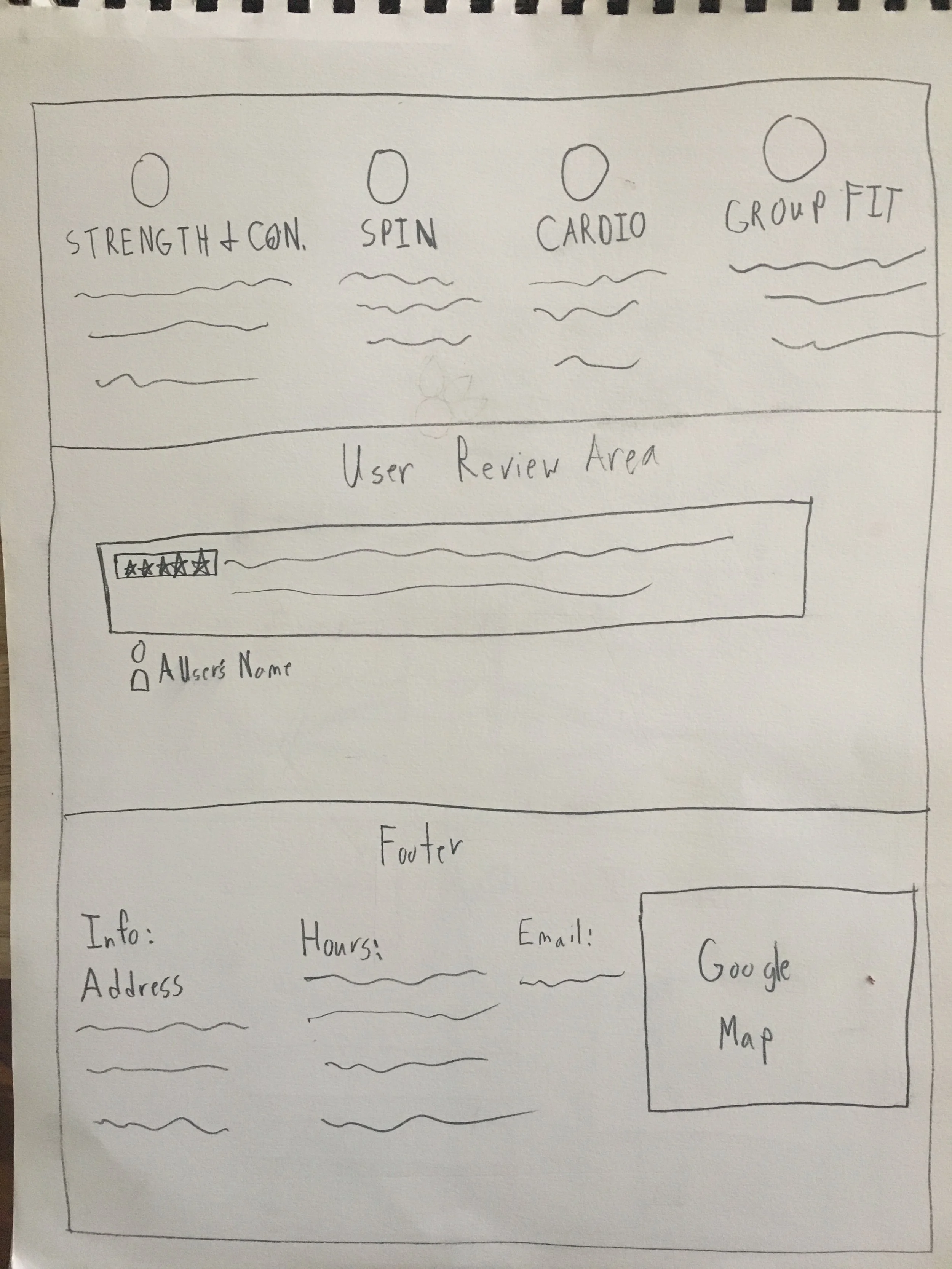
I planned out the general layout with a sketched wireframe.
Outcome:
We decided to put most of the important information in the top menu to cater to the current members. We then used visual markers (orange highlights) to guide prospective users to the free 7-Day pass area.
We highlighted key information in orange to guide the users.
We put a down facing directional arrow in the top banner to guide users to scroll down.
I made the free 7- Day pass button orange.
The landing page has hours of operations in the footer and a map with the location of the gym.
The website is responsive to any screen size.
The darker background helps to point to the orange markers with important information.


