BackBase Design Challenge
Overview: In this design challenge, I was guided to make wireframes for a login sequence, and update a desktop banking app into a native mobile version.
User’s Goals:
Smart features that track spending and budgets
Guided interactions with the software
Fast access to the information they need
Detailed information of their transactions
Easy to use interface
Research:
(Due to the time constraint of the exercise, I was only able to do limited research.)
Competitive Analysis:
I took a look at leading banking companies in my region. Most of the companies in the last couple of years had been doing updates to their mobile banking experience. By comparing these apps, I was able to find out what was the industry standard for a mobile banking app, and what features were more innovative.
My findings from the analysis:
All of the apps included the transaction history.
They all had mobile transfer features.
There was the ability to deposit a check with a picture on most of the apps.
The apps had an area where the user could make minor tweaks to their accounts.
They all had the ability to show multiple accounts.
The apps that were more update to date were using Touch ID logins to authenticate users.
The users were able to find contact information on the mobile apps.
These findings helped me to design the general user experience with only features that are needed.
Exploration:
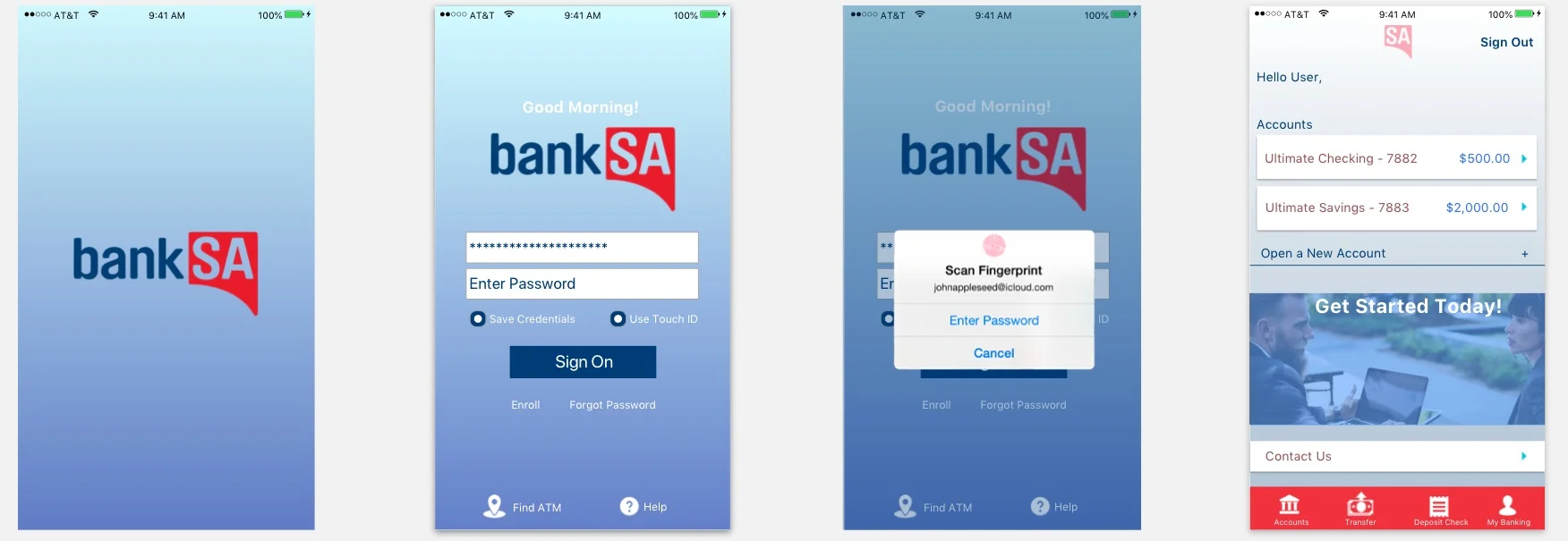
I decided to use an iOS login sequence with Touch ID as an authentication method. iOS holds the highest market share in my region. iOS also is more practical as far as software development across devices. I made a diagram in Axure to show the flow of the screens.
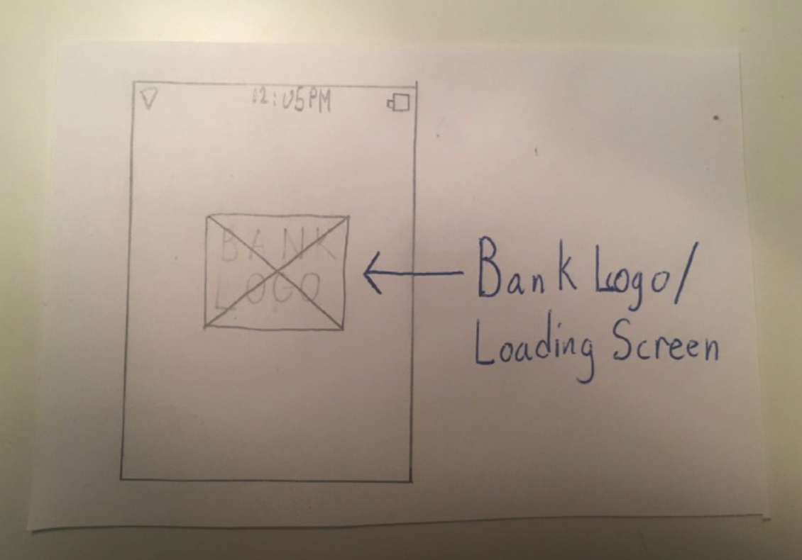
Wireframes: I then sketched out the flow with comments.
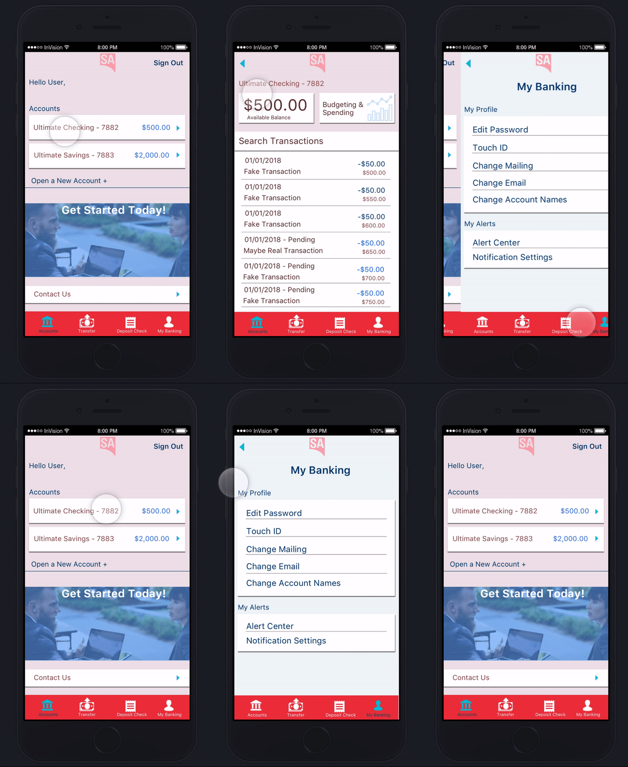
High fidelity mock ups made in Sketch:
Going from desktop to mobile:
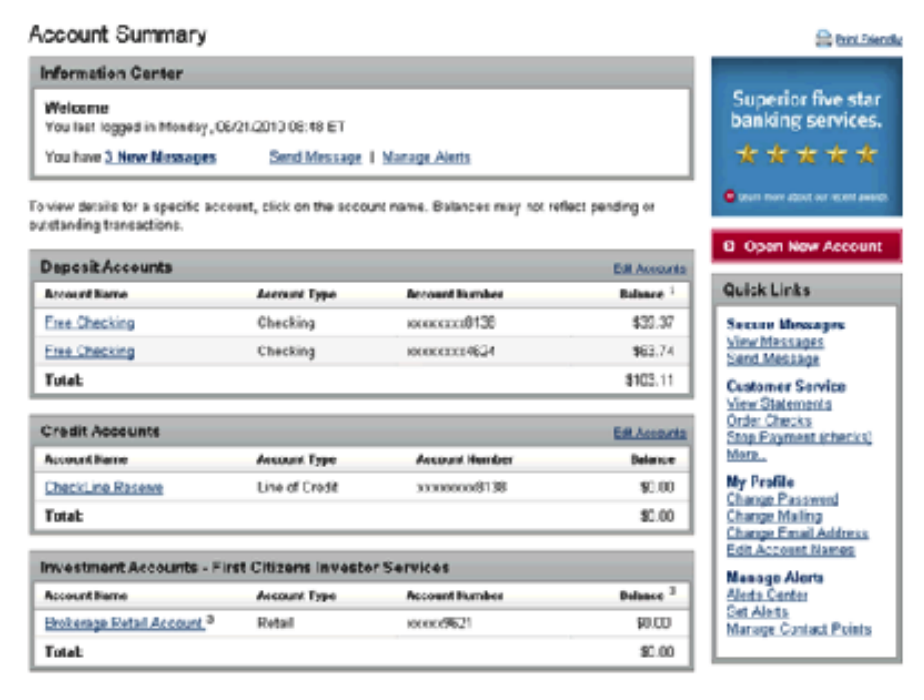
The desktop app for the challenge was extremely out of date. The mobile version would have to be a complete design overhaul to bring it up to date. The original desktop design is below:
Features that I kept:
Mobile check deposits
Account Transfers
Company advertisements
Sign out button (I did not see one on the desktop app)
The user’s transaction history
The customer service contact feature
The ability to see multiple accounts
The ability to make minor edits to the account
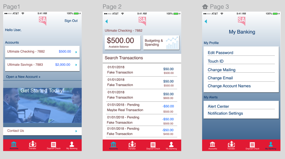
Wireframes: I then sketched the wireframes of the app with the data I collected through the competitive analysis and affinity mapping.
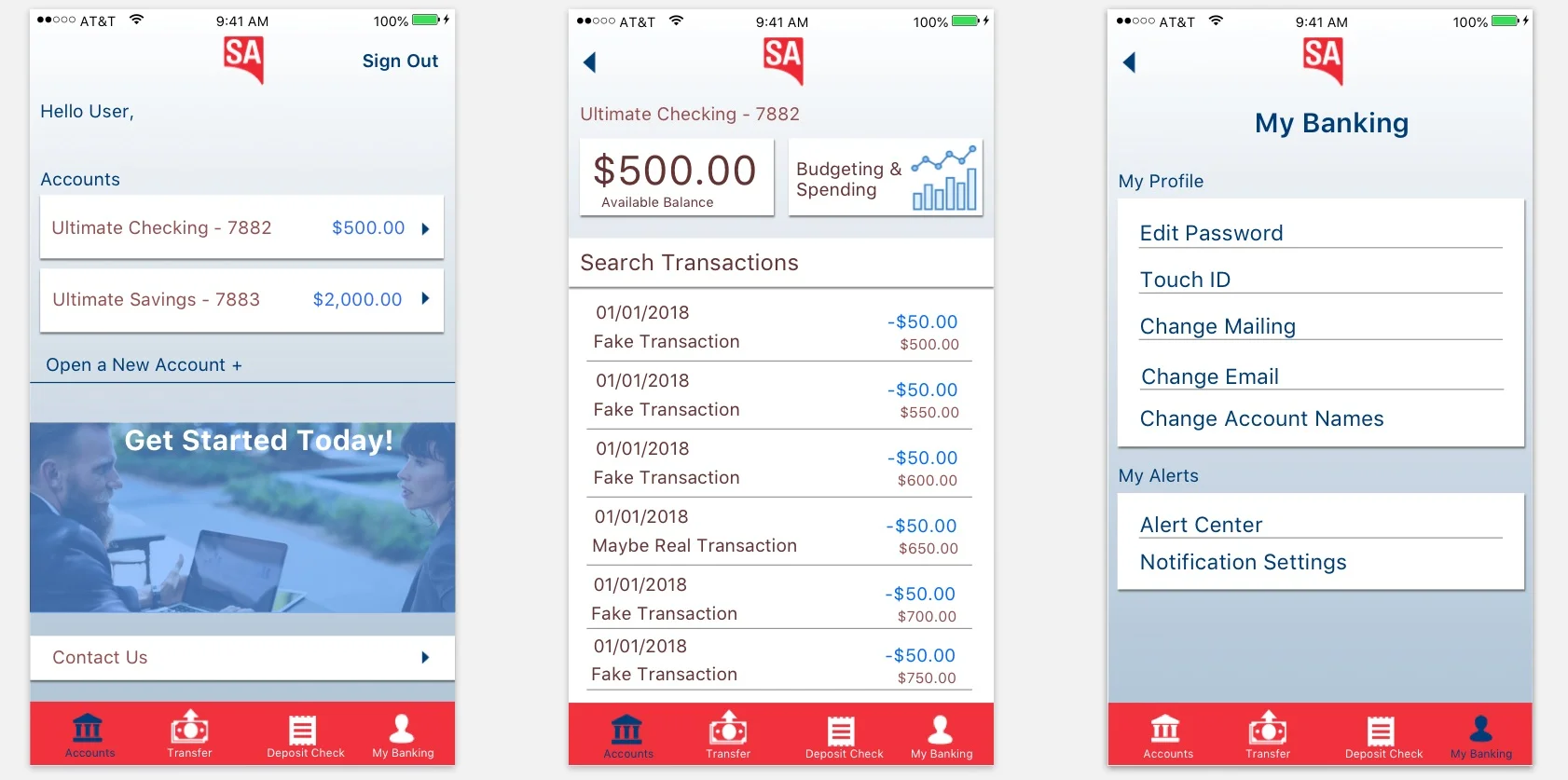
I made a simple design that uses directional arrows and colors to guide the user. I did not use a lot of overflow menus because I wanted everything to be right in the users face. If the user has to look for items then the user experience is too complicated. My design was inspired by the Bank of America app, mostly because that was my current bank. The flow of the app is very intuitive and isn't hiding important features.
High fidelity mock ups made in Sketch:
Outcome:
This project was a lot of fun to create because it’s a service I use almost every day. I subconsciously knew what a good design for a banking application looked like. The time constraint made collecting data tough, but I was able to use research techniques that had a fast turnaround rate to make a simple and efficient design. I took bits and pieces of UI design from the banking apps that organized the information the best. The challenged pushed me to make UI and UX decisions that ended making the app more modern and up to date.
